Image optimization is the process of reducing image file size while maintaining acceptable visual quality for websites and digital platforms. It includes techniques such as compression, resizing, choosing modern image formats, and improving image delivery methods. The goal is to create webpages that load faster without reducing the user experience.
Pictures take up a lot of space on nearly every site now. Shops online, personal journals, learning sites, news spots, portfolios - most rely strongly on images. Yet big picture files tend to drag down load times. They eat more data. Performance dips show up on phones, tablets, desktops alike.
These days, screens come in all shapes - image quality must keep up. Because phones browse just as much as laptops do, pictures have to adjust smoothly across devices. Sharpness matters, sure, yet speed cannot take a backseat. When visuals load slow, attention slips away. A site works better if its images balance detail with efficiency. Screen size changes often; so should how pictures behave. Fast does not mean fuzzy, nor should crisp mean sluggish. Each display asks something different. Meeting those needs quietly improves experience without shouting about it.
When sites load slowly, people often leave fast. That affects how long they stay and whether they interact at all. Search platforms notice these patterns when deciding where to place a page. Images play a big role here since bulky files drag down speed. Fixing them helps behind-the-scenes site health along with data tracking efforts. Over time, this kind of tuning shapes how easily others find the content online.
Website Image Optimization Importance Now
Speed matters when pages open online now. Research keeps finding people walk away from slow sites - no second chances given. Companies struggle because of it, so do schools, writers, even podcasters trying to share work.
Image optimization supports several important website goals:
- Faster page loading speed
- Better mobile browsing experience
- Improved Core Web Vitals performance
- Lower bandwidth consumption
- Visibility improves when search engines can find you more easily
- Improved accessibility across devices
- Reduced server load
Now more than ever, fast-loading pictures matter since phones make up most web visits. When people tap through sites on cellular networks, speeds tend to lag behind home Wi-Fi. Bulky graphics slow down pages, making scrolling feel clunky. Frustration builds quickly, so visitors leave just as fast.
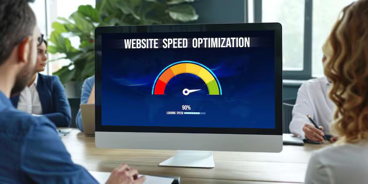
Image optimization affects how fast websites load. This difference shows up clearly when comparing sites with optimized images against those without them. Speed changes become obvious during testing. Performance gains are measurable in loading times. Some sites respond quicker after adjustments. Results depend on file size and format choices. Testing reveals consistent patterns across different devices.
Website Factor Without Optimization With Optimization Page Speed Slower loading Faster loading Mobile Experience Delayed rendering Smooth browsing SEO Performance Lower visibility Better indexing Data Usage Higher bandwidth Reduced bandwidth User Engagement Higher bounce rate Better interaction
Slower internet? That’s where smart image choices make a difference. When visuals load fast, people actually see what they came for. Think schools online, public service pages - sites meant to share knowledge. Lighter design means fewer barriers, especially when connections are weak.
Image Optimization Recent Trends and Updates
Last twelve months brought big shifts in how pictures work on websites. Because browsers updated, plus rules from search engines shifted, coders now handle image tasks differently. Standards moved, tools adapted, approaches evolved - each piece reshaping the way visuals load and behave.
By 2025, WebP along with AVIF started showing up more often online. Because they shrink file size without wrecking clarity, these newer types outshine old-school JPEGs or PNGs. Yet quality stays sharp, even when pixels get compressed tight.
Some major trends include:
- Increased adoption of next-generation image formats
- Greater use of lazy loading techniques
- AI-assisted image compression tools
- Responsive image delivery for multiple devices
- Focus on Core Web Vitals metrics
- Browsers now handle today's image formats more smoothly. Picture loading feels quicker, cleaner. New tech fits without hiccups. Files shrink but quality stays sharp. Speed improves across devices. Compatibility spreads wider than before
When you scroll closer, images start loading - that timing shift is why lazy loading caught on. Pages feel quicker at first visit since visuals wait their turn. Performance scores climb simply by holding back what's not needed yet.
Below the chart tracks how newer ways to shrink image size climbed from 2023 into 2026. While early adoption was slow, gains picked up after 2024. By the final year shown, most sites applied at least one method. Though some stuck with older formats, change became common across platforms. After a point, resistance faded nearly everywhere.
Traditional formats decline from 78% to 40% between 2023 and 2026 while modern formats rise from 22% to 60%
These days, some changes inside web browsers help manage pictures more smoothly. Instead of just showing an image straight away, they wait - adjusting how it loads depending on your device or connection strength. New methods shrink file sizes without losing quality, making pages feel quicker even when signals are weak. What you see fits naturally, no matter if it is a phone or desktop.
Still, search engines keep tweaking how they judge a page's feel. Websites that load quickly plus use lean images tend to rise on results pages. Their edge shows up clearly when measuring smooth visits against site code quality.
Laws Policies and Digital Standards
Picture files that load quick aren’t just smart tech - they’re part of legal rules now in several places. Speedy sites fit better with laws meant to help everyone reach online info, especially those using assistive tools. Officials plus groups focused on internet health keep pushing designs that work well for more people. Easy access isn’t optional anymore - it shows up in policy talks and building guidelines alike.
Website speed and media use face rules shaped by multiple laws
- Accessibility compliance standards
- Data efficiency recommendations
- Mobile usability guidelines
- Privacy-related image handling practices
- Environmental sustainability initiatives
Across the globe, nations adopt guidelines urging clear image labels so tools like screen readers can interpret visuals accurately. Descriptive alt text often pairs with flexible designs to support access. Some regions prioritize these elements through policy while others embed them in digital standards by example.
Out here, more folks are talking about how websites affect the planet. When images and videos take up lots of space, they push extra traffic through networks. That means servers have to work harder, burning more power along the way. Delivering pictures smarter can ease that load a bit. What stays behind the scenes ends up making a difference.
Some areas require government sites to meet certain speed and accessibility rules so everyone can use them easily, no matter their device or connection. Schools and official online services usually focus on efficient design to make navigation smoother.
Browser makers plus search platforms share tips on handling images well - often tied to fast loading and mobile-focused ranking. Some suggestions pop up around how files behave when pages load quickly.
Tools and resources for image optimization
Images load faster when site builders pick smart tools. Since speed matters, they test pages carefully using different software. Some programs shrink file sizes without losing quality. Others adjust picture dimensions based on screen type. Each choice shapes how quickly visuals appear. Tools like these handle tasks that would take too long by hand.
Common categories of image optimization resources include:
- Image compression platforms
- Website performance analyzers
- Page speed testing tools
- Responsive image generators
- Graphic editing applications
- Browser developer testing panels
- SEO auditing dashboards
Below, a look at how each type of optimization resource functions.
Tools for compression speed analysis responsive design SEO audits and graphic editing
Some sites share tips on picture types alongside ways to make pages fit any screen, while speeding things up. Step-by-step walkthroughs, coder notes, or tweaks for speed still guide new learners through today’s web rules.
Pictures fit better when they match set sizes, especially on blogs or phone screens. Since every platform has its own space limits, using fixed measurements keeps things steady. Skipping random resizing means pages load without hiccups. Social posts, banners, even stories - all stay sharp when sized right.
Image Optimization Tips for Websites
Most of the time, sharp images come from mixing several methods at once. Relying on just a single approach often falls short.
Important optimization practices include:
Choosing the Right File Format
Pictures look good in some styles, yet other kinds fit certain uses more closely. A format might shine with photos but stumble on logos just the same.
- JPEG works well for photographs
- PNG supports transparency
- WebP offers smaller file sizes
- AVIF provides advanced compression efficiency
- SVG works well for icons and vector graphics
Compressing Images Properly
Picture files get smaller when squeezed just right. A smart squeeze keeps images sharp yet loads faster on web pages.
Using Responsive Images
Images shift smoothly based on your screen's dimensions - so they fit just right. Depending on the gadget you're using, clarity stays sharp without loading extra bulk.
Implementing Lazy Loading
When people start scrolling, only then do images load if they’re ready to appear. At first, the page loads faster since it skips pictures hidden below. Scrolling triggers what shows next - nothing happens before that.
Descriptive Alt Text Writing
When images have descriptive labels, people using screen readers benefit. Search engines get better at finding those pictures too because they rely on written cues instead of sight. A well-labeled photo travels further online since machines can make sense of it through words placed nearby.
Avoiding Oversized Uploads
Heavy image files often drag down page speed. To keep things smooth, size pictures according to how big they appear online.
Frequently Asked Questions
Picture tweaking when building a site - what does that mean?
Smaller files help pages load faster, especially when smart techniques deliver them efficiently. Picture clarity stays strong even as sizes shrink through careful tweaks. Delivery gets a boost using modern approaches tailored for speed. Fewer delays happen because images arrive quicker across connections. Quality dips slightly but remains acceptable during these changes. Adjustments aim squarely at making sites feel snappier overall.
Why are large images harmful for website speed?
Heavy picture files slow down page loads. When images take longer to appear, phone users might get frustrated. Sluggish networks suffer most, pushing visitors away before content even shows up.
What picture type gets suggested most often these days?
Picture newer types like WebP or AVIF - they shrink files without wrecking how images look. These often get suggested simply since they handle size and clarity well together.
Image Optimization and SEO Performance?
Faster sites tend to feel smoother for visitors - this helps them rank better because search engines notice how well things run behind the scenes.
What is lazy loading for images?
Only when someone scrolls close does an image start loading. Pages appear faster at first because of this trick. Less data gets used without purpose.
Can image optimization improve mobile usability?
Faster loading happens when pictures are smaller in size, especially on phones and tablets. Smooth browsing improves because of it, even when connections aren’t strong.
Conclusion
These days, sites just work better when pictures are handled right. Since web pages lean hard into visuals, making them sharp without slowing things down helps people actually use the site - plus it plays well with search engines too.
Now picture this: newer image types, faster browsers, tighter rules on speed - each one nudging web design toward smarter visuals. As phones dominate online access, users expect snappier pages, pushing efficiency in images from optional to essential.